
CASE STUDY • 2024 • BRANDING & UX DESIGN
Hen Party Deals
Hen Heaven was a well-loved hen party company with a name that said nothing about why people actually booked: the deals. I led its full rebrand into Hen Party Deals - a brighter, cheekier identity built around great value and safe hands - and rolled it out across everything from the logo to the live website. An in-house rebrand, start to finish.
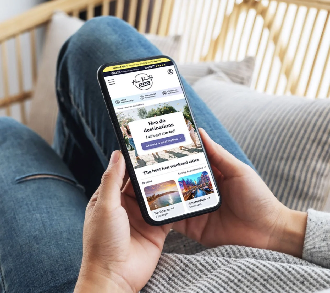
ABTA-regulated travel brand • Rebranded from Hen Heaven • Launched April 2024 and still live today
The brief
The Eventa Group had built a solid hen party business trading as Hen Heaven. Years of happy customers, a real reputation, and ABTA regulation behind it. But the name, with its soft angel-wing logo, leaned into "heavenly" and said nothing about the thing that actually won the booking: value.
They wanted to reposition as a deals-led brand. The place you go for a brilliant hen weekend at a price that doesn't make your eyes water. That meant a new name, a new look and a new voice, without throwing away the trust they'd spent years building.
My job was to lead the whole thing in-house, from the first workshop to the external launch, and to manage the brand once it was out in the world.
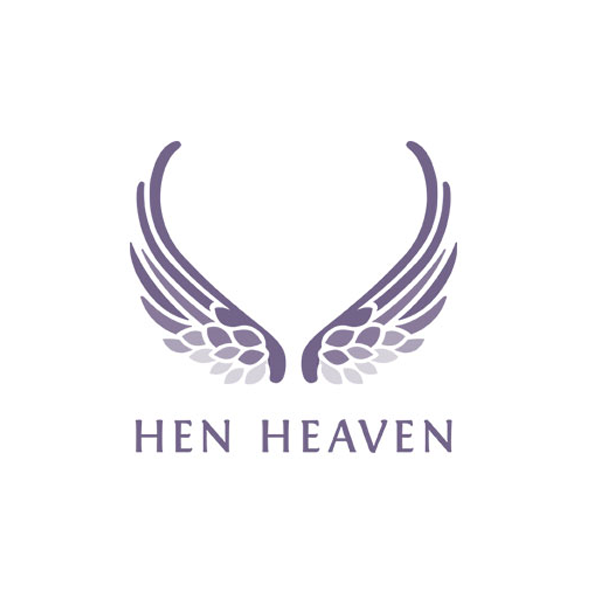
Original logo
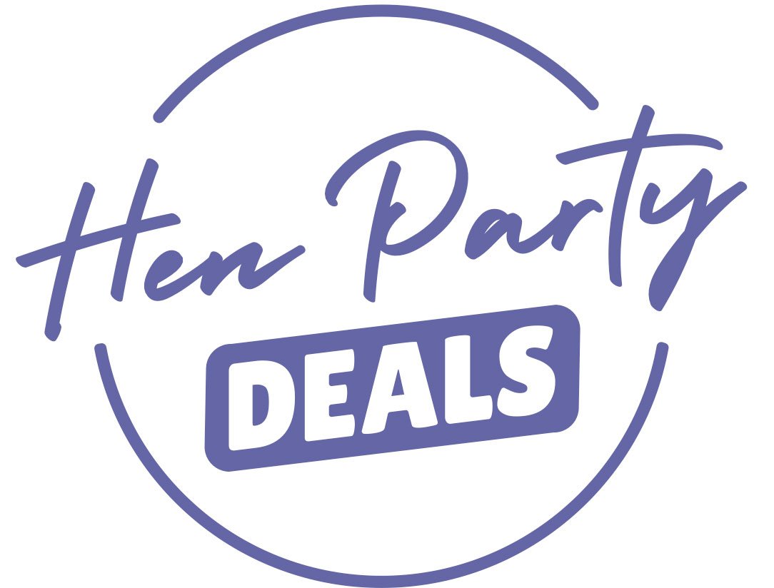
Rebrand
At a glance
Client
The Eventa Group
My role
Brand lead - the full rebrand, in-house
The rebrand
Hen Heaven → Hen Party Deals
Also delivered
Brand guidelines, website design and front-end build, social campaigns, email and Canva templates, document templates
How we worked
Internal workshops and values sessions, then hand-off to the dev team
Sector
Hen and group travel, ABTA-regulated
Scope
Identity, guidelines, web, social, email, templates - the full toolkit
Status
Launched April 2024. Still the live, trading brand today



The real challenge: fun that still feels like safe hands
A deals brand risks looking cheap. A hen brand risks looking so giddy that nobody trusts you with their money and their passports. Hen Party Deals had to pull off both at once - full of personality, but visibly a proper, ABTA-regulated travel company. Most of my decisions came back to holding that line.
Fun, not cheap
The palette pairs a confident purple and near-black with pops of yellow and coral, so the brand reads playful and premium rather than pound-shop. Bright, but never tacky.
Cheeky, but trustworthy
I anchored the brand in two archetypes in equal measure: the Jester (playful, up for it, a bit of a laugh) and the Everyperson (warm, dependable, down to earth). A reserved "trust" green and clear, plain-English copy carry the serious bits - payments, ABTA, the promises that matter.
One idea, doing the heavy lifting
The logo is a handwritten script sitting inside a loose circular stamp, quietly nodding to a "sale" or "deal" mark without ever spelling it out. It tells you what the brand is about before you've read a word.
The process
A proper rebrand, not a new coat of paint. Everything below flowed from the strategy first.
I started with the thinking, then built the identity on top of it, then made sure the whole business could actually use it.
01
02
03
04
05
Research and discovery
Internal workshops and values sessions with the team, a hard look at the competition, and a clear read on what customers were really booking on: price and peace of mind.
Define the brand
The repositioning, the name change to Hen Party Deals, the values (Care, Expertise, Integrity, Togetherness, Fun), the Jester-meets-Everyperson archetype, and a tone of voice that sounds like a friend who happens to know the best deals.
Design the identity
The stamp logo and its variations, the colour palette, the typography (New Spirit for headlines, DM Sans for body, Holiday as a playful script accent), plus patterns, icons and a clear direction for photography.
Build the toolkit
A full brand guidelines document, the website design and a good chunk of the front-end build (HTML and CSS), social campaign artwork, email templates, Canva templates for posts and carousels, and branded document templates. Basically everything the business would ever need to pick up and run with.
Launch and manage
An internal launch to get the whole team behind the new brand, then the external launch to customers, followed by ongoing brand management to keep everything consistent as it grew.

The new identity, top to bottom
The logo
A hand-drawn script inside a circular stamp, built to feel like a deal without shouting it. Supplied in purple, black and yellow versions for any background.
Colour
Purple and near-black to anchor it, yellow and coral to bring the fun, a calm grey for backgrounds and a dedicated green for trust cues.
Typography
New Spirit for characterful headlines, DM Sans for clean, readable body copy, and the Holiday script for the odd playful flourish.
Patterns and icons
A set of hand-drawn party icons and repeatable patterns that add personality to everything from the website to printed brochures.

The website
Designed the mobile-first site end to end, prototyped it, then handed clean, dev-ready files over the line - and built a large part of the front-end myself.
Social and campaigns
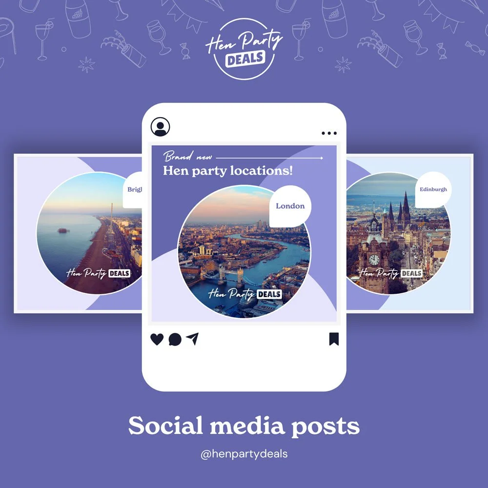
Campaign artwork and reusable templates for posts and carousels, so the team could keep the feed on-brand without starting from scratch each time.
Email and templates
Branded email templates plus Canva and document templates, so every touchpoint the business uses looks like it belongs to the same brand.
The brand guidelines
A full guidelines document covering the brand story, values, tone of voice, technical and accessibility rules, the visual system and every touchpoint.
“She just gets it”

"Evie has this incredible ability to work on design projects with the smallest of briefs and she just gets it straight away. The speed and quality of her work was incredible and she was never afraid to take on additional tasks.”
Robert Hill
Founder, Hen Party Deals